


Put your hero image first, then the title, then price and any discount, then a single trust anchor (star rating plus review count), then a visible Add to Cart button, then three to five highlight bullets, then variant selectors if needed. Push the full description, specifications, and FAQ below the fold or into tabs. This order works because it front-loads the signals a buyer needs to decide (what it is, what it costs, whether others trust it, how to buy it) while still giving Google and AI crawlers the long-form content they need to index the page properly.
Your immediate next action: open your Shopify theme editor, click into the product template, and check whether your Add to Cart button sits above or below your description block. If it’s below, that’s costing you conversions right now.
- Hero image and one lifestyle shot in the gallery
- Title (H1), then price and discount
- Star rating and review count as a single anchor
- Visible Add to Cart, then variant selector
- Short highlights block, full description and FAQ below
Buy-box anatomy: what to front-load and why it converts
The buy-box is everything a shopper sees before they scroll. Get this wrong and no amount of clever copy further down the page will save the sale.

Start with the hero image. Lead with a clean, product-only frame, then follow with a lifestyle shot in the carousel. Clothing and home goods tend to benefit from lifestyle context appearing early; technical or functional products (tools, electronics, supplements) usually convert better when the product-only shot leads. Keep your title under 70 characters and work your primary keyword in naturally rather than stuffing it. A title like “Merino Wool Hiking Socks, 3-Pack” tells a shopper exactly what they’re getting in under two seconds.
Price and discount treatment matters more than most merchants assume. Showing the pound amount saved (not just a percentage) tends to land harder psychologically, particularly on higher ticket items where “£40 off” feels more concrete than “20% off.” Directly beneath or beside the price, place one quantitative trust anchor: a star rating and review count. Product pages that surface this within the first 200 pixels of the product section convert measurably better than pages that bury social proof further down. Resist the temptation to add more than one trust signal here. A full review wall competes for attention rather than reinforcing the buying decision.
Your Add to Cart button needs to be visible without scrolling on mobile wherever your theme allows it. If your product page runs long, a sticky Add to Cart bar that follows the shopper down the page recovers sales you’d otherwise lose to scroll fatigue. Keep the variant selector close to the CTA, never buried inside a tab or accordion; shoppers shouldn’t have to hunt for the size or colour picker.
Add a slim microtrust row underneath: payment icons, a shipping or returns badge, maybe a short guarantee line. One row, not three.
Pro Tip: Test your buy-box on an actual mid-range phone, not just your desktop browser resized smaller. Real mobile rendering often reveals a squashed CTA or an overflow issue that desktop testing never shows.
Finally, add your short highlights block: three to five benefit-led bullets, not feature specs. “Keeps feet dry for 12+ hours” beats “68% merino wool blend” every time, because shoppers scan for outcomes before they read for detail.
Which layout pattern fits your product?
Not every product deserves the same treatment. Matching your layout pattern to the product type and buyer’s decision stage is often the single biggest lever you’re not pulling.
- Standard ecommerce layout. Gallery on the left, buy-box on the right, description and specs below. This handles the majority of SKUs well: apparel, homeware, most consumer goods where the buyer already knows roughly what they want.
- Long-form hero layout. Full-width hero imagery, storytelling blocks, embedded testimonials, and a delayed but reinforced CTA. Reserve this for hero SKUs or high-consideration purchases, think mattresses, skincare systems, or anything over £150 where the buyer needs convincing, not just informing.
- Minimal quick-buy layout. Large image, title, price, CTA, nothing else competing for attention. This suits low-consideration repeat purchases: refills, consumables, anything a returning customer buys on autopilot.
- Tabbed or accordion layout. Keeps dense specifications, ingredient lists, or care instructions out of the main scroll while leaving highlights visible. Useful for supplements, electronics, or anything with regulatory or technical detail that a first-time buyer doesn’t need immediately.
Run through a short checklist before picking: how complex is the product to explain, how long do sessions typically last on this page, where in the funnel does this traffic usually arrive, and what share of your visits are mobile. A paid social ad sending cold traffic to a £200 skincare device needs the long-form hero treatment. A returning customer reordering protein powder needs the minimal layout and nothing else.
The one-line rule that cuts through most indecision: pick the fewest elements that answer your category’s top three buyer objections. For hiking boots, that’s usually sizing, waterproofing, and break-in comfort. Answer those three things clearly and everything else is decoration.
How to change the product description layout in Shopify
Reordering your layout doesn’t require a developer for most changes. Here’s the path from easiest to most involved.
- Open the theme editor first. Go to Online Store, click Customize on your live or a duplicate theme, then click into any product page. Most modern Shopify themes present the buy-box as separate blocks (Title, Price, Variant Picker, Quantity, Buy Buttons, Description). Drag these blocks in the sidebar to reorder them; changes apply instantly in preview. This handles perhaps 80% of layout requests without touching a line of code.
- Use a page builder for structural changes. Drag-and-drop tools built for Shopify (such as GemPages or Shogun-style builders) let you build custom sections, add tabbed content, or design a long-form hero layout without editing Liquid. These earn their cost when you need something the native theme editor simply can’t do, custom accordions, embedded video blocks, comparison tables inside the description.
- Edit Liquid only when you have a specific reason. The theme editor and page builders cover most needs, but occasionally you’ll want to move
{{ product.description }}itself, say, above the buy-box for an SEO-heavy category page. This is where risk creeps in. Moving the description too high commonly pushes the Add to Cart button below the fold, which tends to hurt conversion more than the SEO gain helps. If you do this, compensate with a sticky Add to Cart bar so the button stays reachable regardless of where the description sits. - Set mobile order separately from desktop. CSS order properties and responsive overrides let you show a different block sequence on mobile without changing your desktop layout. Describe the mobile sequence explicitly to any developer or page-builder support team; “reorder for mobile” alone is too vague, they need the exact block order you want on a phone screen.
- Duplicate before you touch anything. Shopify lets you duplicate your live theme for free. Make every layout change on the duplicate, preview it thoroughly, then publish once you’re confident. This is standard practice, according to Shopify’s own theme documentation, and it’s the difference between a five-minute fix and a Sunday night scramble.
Pro Tip: After any reorder, tab through the page using only your keyboard. If focus jumps somewhere illogical, or a heading level got shuffled out of order, your accessibility structure broke during the edit and needs fixing before you publish.
Measure before and after. Even a rough week-over-week comparison of Add to Cart rate tells you whether the reorder helped or hurt.
The seven fields that actually decide your SEO
Most merchants write one field, the description body, and ignore six others that carry just as much weight. Seven editable fields together determine how well a product page ranks: product title, meta title, meta description, URL handle, description body, image alt text, and product type or tags.
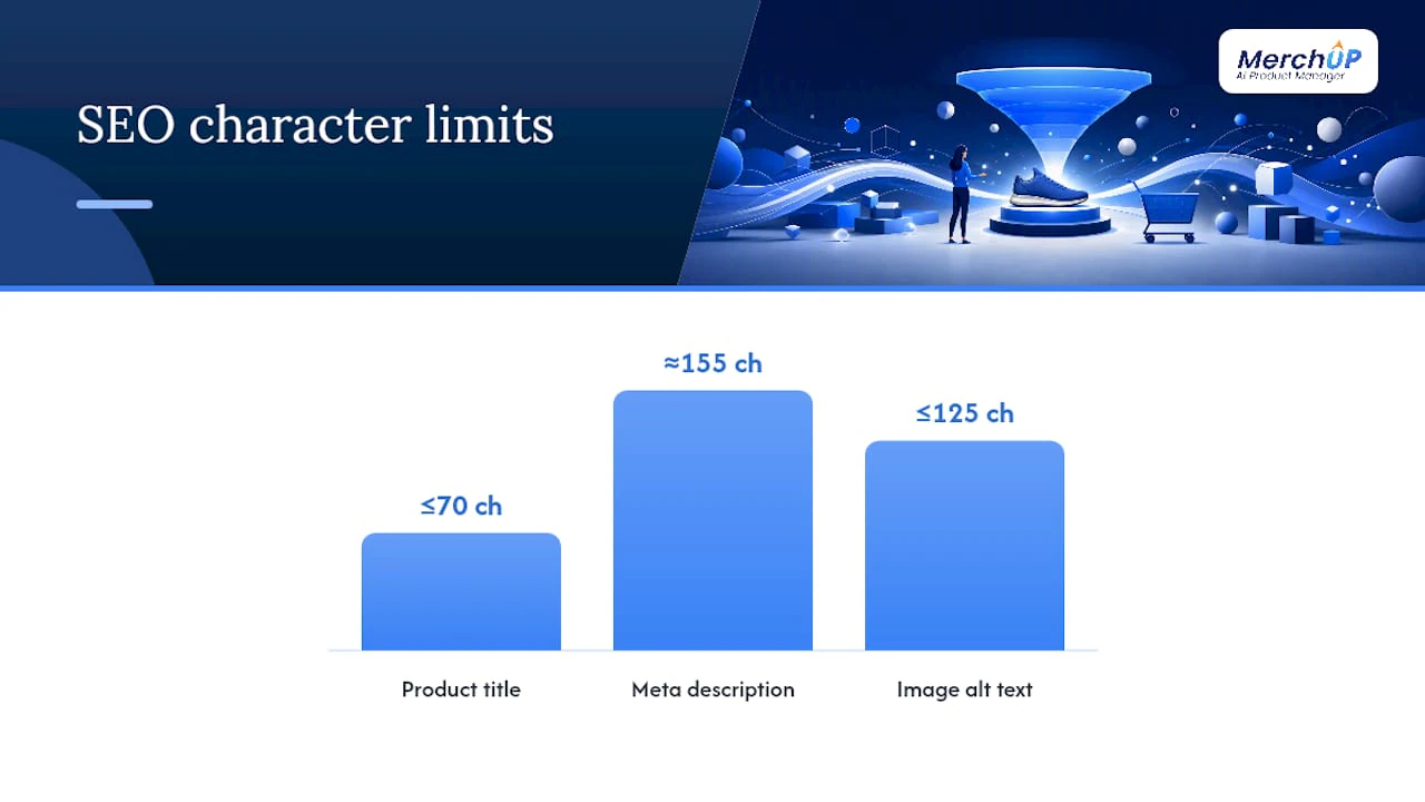
Keep your title under 70 characters with the primary keyword placed naturally near the front. Your meta title can differ slightly from your on-page title, useful when you want a call to action in search results that would look odd on the page itself. Meta descriptions should sit around 150 to 160 characters and include a reason to click, not just a restatement of the title. URL handles should be short and keyword-relevant; “hiking-boots-mens” beats a default string of numbers every time. Image alt text under 125 characters should describe the actual image, not just repeat the product title verbatim across every photo.
For the description body itself, a four-part structure consistently outperforms unstructured copy:
- One opening sentence naming the product and who it’s for
- Three to five benefit-led bullets
- A short paragraph (two to four sentences) weaving in secondary keywords naturally
- A brief FAQ block answering the category’s most common objections
A useful benchmark: standard SKUs perform well at 150 to 300 words, while high-consideration products often warrant 400 to 600 words to properly address hesitation.
Place your primary keyword in five specific spots: the title, the meta title, the first sentence of the description, one bullet point, and the main image’s alt text. Beyond that, Shopify ships basic Product schema automatically, but adding aggregateRating, brand, and GTIN or MPN data where available, plus FAQ schema, improves your odds of rich results and gives AI search engines cleaner structured data to cite from.
Building templates that scale across hundreds of SKUs
Writing every product page from scratch works fine for twenty SKUs. It falls apart at two hundred.
The fix is deciding upfront which slots stay unique per product and which get templated. Your opening sentence and highlight bullets should always be unique, generic openers read as thin content and hurt SEO across a whole category. Your FAQ structure, dimension formatting, and care instructions, however, can follow a fixed template with variables swapped in per product.
Shopify’s metafields let you inject structured data (fabric composition, dimensions, care instructions) into a consistent layout block without rewriting the surrounding template each time. Combine that with the rich text editor for anything that needs formatting beyond plain metafield values.
A practical workflow looks like this: brief the category’s key selling points, draft with AI assistance to handle the repetitive structural work, have a human editor tighten the specifics and check accuracy, then publish. This is where a tool like Merchup AI fits naturally, handling the templated drafting so your team’s time goes into the parts that need a human eye: accuracy checks, tone, and category-specific nuance.
Before any bulk push goes live, run three checks: a duplicate-content scan across similar SKUs, confirmation that every product’s opening sentence is genuinely unique, and a spot-check of meta descriptions to catch any that got left blank or duplicated during a bulk edit.
Which layout change should you test first?
Not every idea deserves equal priority. An impact-versus-effort matrix keeps you from spending three weeks on a full redesign when a ten-minute change would move the same needle.
- Plot your ideas on two axes. High impact, low effort changes go first, moving your star rating above the fold, adding a sticky Add to Cart bar, tightening your title. Full template redesigns sit in the high effort quadrant and should wait until the quick wins are exhausted.
- Change one thing at a time. Testing a new hero image and a repositioned CTA simultaneously tells you nothing about which one actually moved the number. Isolate variables even when it’s slower.
- Run tests long enough to trust the result. A three-day test on a low-traffic product page is noise, not data. Give it enough time and volume to separate a real signal from normal daily fluctuation.
- Track mobile and desktop separately. A change that lifts desktop conversion can quietly hurt mobile, or vice versa, if you only look at the blended number you’ll miss it.
- Watch the metrics that actually matter. Add-to-cart rate, PDP conversion rate, bounce rate, average order value, and smaller signals like clicks to the variant selector or size guide all tell you something different about where shoppers hesitate.
Shopify’s built-in analytics, GA4 ecommerce event tracking, and session recording tools together give you enough instrumentation to diagnose most surprises without needing a dedicated data team.
Three block orders you can copy today
Standard product page pattern: Hero gallery, title, price, star rating, Add to Cart, variant selector, highlights, description, FAQ. This handles the bulk of general merchandise because it answers “what is it, what does it cost, can I trust it, how do I buy it” in exactly that order, which mirrors how most shoppers actually think.
Long-form hero pattern: Full-width hero image or video, title and price, a short highlights teaser, then storytelling blocks (problem, solution, proof), embedded testimonials, a detailed FAQ, and a repeated CTA near the bottom. Use this for considered purchases where the first screen alone won’t close the sale, premium skincare devices, furniture, or anything requiring genuine persuasion.
Minimal quick-buy pattern: Large product image, title, price, Add to Cart. Nothing else. This fits consumables, refills, and anything a repeat customer buys without needing to be resold, protein powder, coffee pods, printer ink.
Real Shopify stores across dozens of documented examples show these patterns repeating for good reason: they map to how differently shoppers approach cheap versus considered purchases.
One small anonymised example worth noting: a merchant who simply moved their star rating and review count from beneath the fold to directly beside the price, without touching anything else on the page, saw a measurable lift in conversion within weeks. No redesign, no new copy. Just a trust signal moved eight inches up the page.
What most merchants get wrong about layout priority
Working through product-layout problems across large catalogues teaches you one thing quickly: most merchants over-invest in the description copy and under-invest in the order things appear. A beautifully written paragraph sitting below three unrelated widgets and a buried CTA does almost nothing.
The most common mistake I see is pushing the Add to Cart button below the fold to make room for “just one more” trust badge or feature callout. Every extra element in the buy-box has a cost, even a good one. The second is treating every SKU the same way, applying a long-form hero layout to a £12 consumable confuses shoppers who just want to reorder quickly.
Bring in a developer when you need genuine Liquid changes to core templates. Use a page builder or a templating tool like Merchup AI’s description templates for everything else, they cover far more ground than most merchants assume.
Scale your product description layout with Merchup AI
Merchup AI gets your entire catalogue onto the four-part description pattern without you rewriting every product by hand. The platform drafts SEO-structured copy, honest opening sentences, benefit bullets, and FAQ blocks, using customisable templates you control, then publishes straight to your live Shopify catalogue through a visual editor built for bulk work.
That matters because the layout advice in this guide only pays off if your copy actually fills each slot well: a unique opener, sharp highlights, a genuinely useful FAQ. Doing that manually across two hundred SKUs eats a week. Doing it with structured AI drafting and a human pass for polish takes an afternoon. Merchup AI’s real-time catalogue tracking also means you can see which products still need updated descriptions instead of guessing.
If your product pages need the layout fixed and the copy rebuilt to match, start with Merchup AI and see how quickly your catalogue gets to a consistent, conversion-ready standard.
Sources
- Product page conversion engineering — ScaledByDesign Insights
- Shopify product description SEO: rank and convert in 2026 — StudioNiza


Comments
No comments yet — be the first to share what you think.