


A good mobile product description is short at the top, scannable all the way down and honest about the details that decide a purchase. Lead with what the product is and why it matters, put the key facts in bullets, keep specifications within reach but secondary, and keep the buy button visible. This guide shows how to build that, section by section, and how to keep it up when you add new products every week.
TL;DR
- On a phone, the first screen has to show the product name, hero image, price, a trust signal and the add-to-cart button, so your opening lines must earn the scroll.
- Lead with the product and its most relevant benefit, then use short sentences, bullets, clear headings and bold sparingly so shoppers can skim.
- Put sizes, compatibility and purchase conditions under labelled headings or in a small table, next to the action they affect.
- Write accurate image alt text and add Product structured data, so people and search engines read the same facts.
- Test on a real phone with real shoppers, then use a repeatable template so every new listing meets the same standard.
Why mobile changes how you write
On a desktop, a shopper sees the photo, price, description and reviews at once. On a phone, they see a slice. Everything stacks vertically, and each extra paragraph pushes the next decision further down the page. A description that reads fine on a laptop can turn into a wall of text on a six-inch screen.
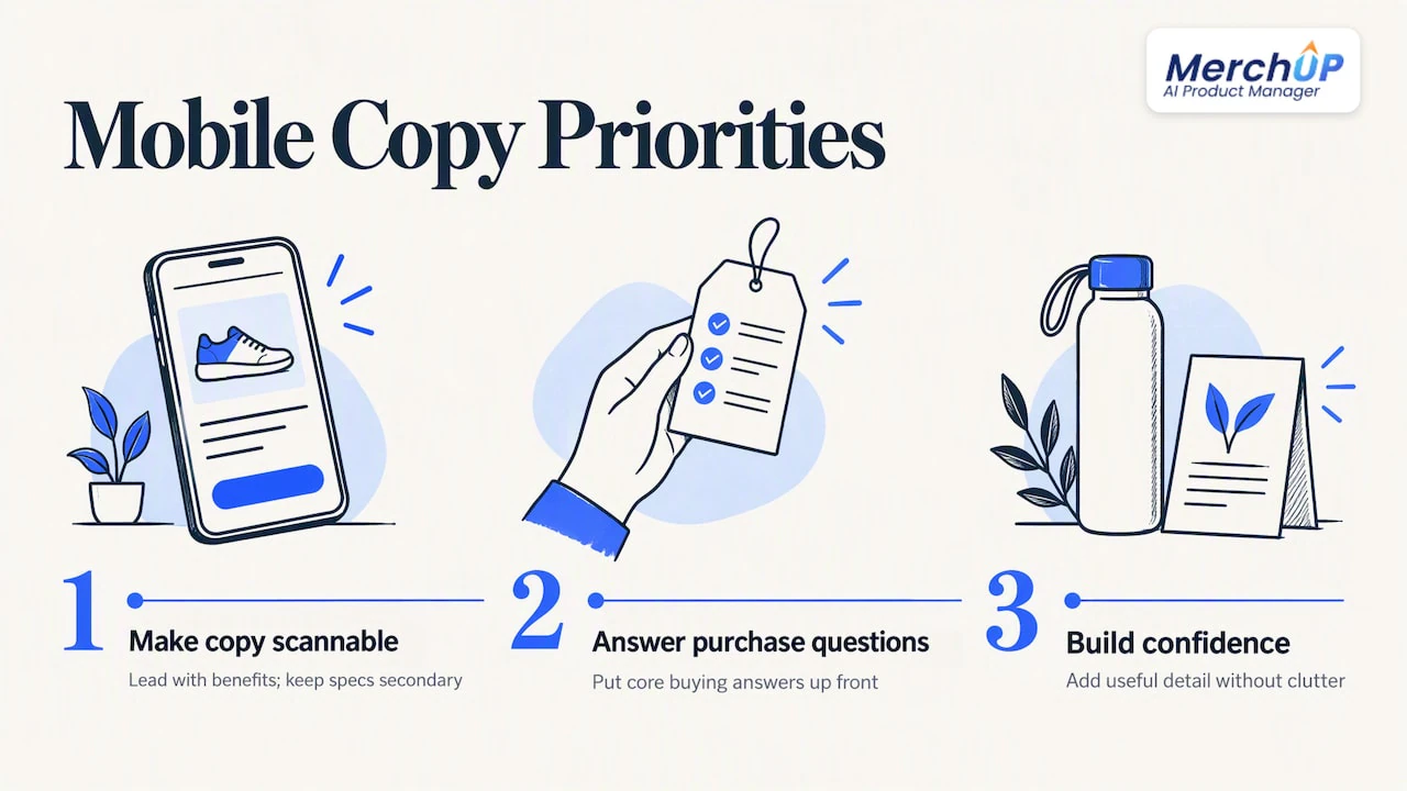
The practical consequence is that mobile copy has to do three jobs in order. It has to be immediately scannable, answer the core purchase questions and give enough detail to build confidence without cluttering the screen. It should lead with benefits and keep technical specifications accessible but secondary.
That is a different brief from “write a good product description”. It means thinking about the order of information, the length of each block and where the eye lands after a thumb swipe. If you want the wider fundamentals first, our guide to product descriptions that sell covers the copywriting side.
Design the first viewport first
The first screen a shopper sees without scrolling is the most important area on a mobile product page. According to Uxitt’s Shopify product page guide, it should show the product name, hero image, price, a trust signal such as a star rating, and the add-to-cart button. Mobile layouts that work well stack content vertically and use finger-friendly tap targets of at least 44px.
What does that mean for your description? Three things.
- Your title is part of the copy. Put the product type and the one differentiator in it. “Waxed canvas weekender bag, 40L” tells a mobile shopper more than a brand-only name.
- Your first line sits close to the fold. If the short description or first sentence is generic, you waste the most valuable text you have.
- The buy button must not vanish. A common mobile failure is a buy button pushed below the fold, and a sticky add-to-cart bar keeps the purchase action reachable while people read on. That is a theme setting, not a copy task, but it changes how long your description can safely be.
Write a first line that earns the scroll
Open with identity plus relevance: what the thing is, and who or what it is for. Compare these two:
- Weak: “Introducing our best-selling bag, crafted with love for every adventure.”
- Stronger: “A 40L waxed canvas weekender that fits under an airline seat and stays dry in rain.”
The second tells a phone shopper in one line whether to keep reading. Only claim what is true of your product, and keep the claim specific enough that a customer can check it.
Structure the description so it can be skimmed
Mobile shoppers skim. The usual advice from usability research is simple: use bullet points for key features and benefits, with short sentences, clear headings and bold text to make content easier to scan. Here is a structure that works for most catalogues.
| Block | Length on mobile | What goes in it |
|---|---|---|
| Opening line | 1 to 2 sentences | Product identity and the main benefit |
| Benefit bullets | 3 to 5 bullets | One benefit each, with the feature that proves it |
| Detail blocks | 2 to 4 short paragraphs | Materials, use cases, care, fit, each under its own heading |
| Specs and compatibility | Small table or labelled list | Dimensions, sizes, models, requirements |
| Purchase conditions | 1 to 3 lines | Shipping, returns, personalisation limits, near the button |
Keep paragraphs to two or three lines
A paragraph that looks tidy on desktop can fill the whole screen on a phone. Aim for two to three lines per paragraph as they appear on a narrow display. If you are unsure, preview the page on your own phone before publishing. Our piece on product description readability goes deeper on sentence length and layout.
Use headings properly
Headings help scanning, and they help people using screen readers. Accessibility guidance recommends one H1 for the product title, H2s for major sections and H3s for subsections. On most Shopify themes the product title already is the H1, so use H2s or H3s inside your description and never skip levels just to get a bigger font.
Use bold with restraint
Bold helps the eye find the one thing that matters in a block: a size, a material, a compatibility note. If you bold every second phrase, nothing stands out. Pick at most one or two bold phrases per block.
For ready-made layouts, see our product description structure guide and the copy-and-paste templates.
Answer the questions that stop the sale
Shoppers on a phone rarely open another tab to find the missing detail. They leave. So the description has to answer what they need to choose and buy.
The approach recommended in Vow’s guide to mobile product copy is to lead with the product and its relevant benefit, group related facts under descriptive headings, and make suitability, purchase conditions and limitations easy to find. In practice, that means working through a short checklist for each product:
- What is it, and what is it for? One sentence, no jargon.
- Will it fit or work with what I own? Sizes, models, voltage, file formats.
- What is it made of, and how do I look after it?
- What is in the box?
- What does delivery or returns look like for this item?
- What are its limits? If it is not waterproof, or not suitable for a certain use, say so plainly in the place a buyer will look.
Honest limits build trust and reduce returns. They are part of a good description, not a weakness in it.
Put compatibility in a table
When the product has requirements, a clearly labelled list or a concise table works for compatibility, and purchase conditions belong beside the action they affect. Keep tables to two or three columns so they do not scroll sideways. A table that overflows on a narrow screen is one of the most common complaints store owners raise when they try to adapt a description table for a mobile view in an older theme.
Example for a phone case:
| Phone model | Fits | Wireless charging |
|---|---|---|
| Model A | Yes | Yes |
| Model B | Yes | Yes |
| Model C | No | n/a |
Three columns, short cell text, no scrolling.
Write for search without hurting readability
Mobile descriptions still have to be found. Write the way a person would describe the product, include the terms shoppers actually use once or twice where they fit naturally, and stop there. Stuffing keywords makes a phone screen unbearable. Our product description SEO guide covers keyword choice in detail.
Two technical layers do more work than extra keywords.
Alt text for every product image
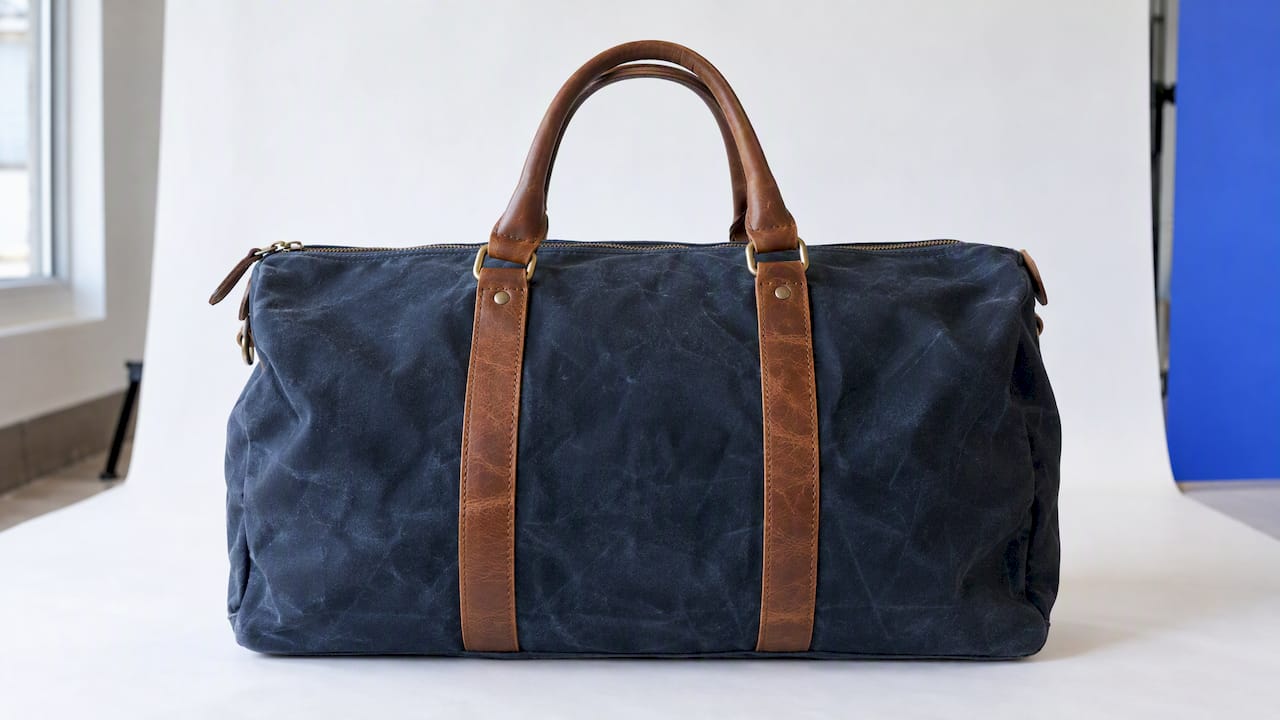
Mobile shoppers swipe through images more than they read. Images also need text equivalents. Under WCAG 1.1.1 (Level A), product images need alt text that describes the product accurately, including colour, material, style and key visual features. Write “Navy waxed canvas weekender bag with leather handles, front view” rather than “bag1.jpg” or a string of keywords.
Structured data
Google’s documentation recommends adding structured data using the schema.org Product type, so search engines can read attributes such as price, availability and description for product results. Most Shopify themes output a basic version already, but it only reflects what is in your product data. If your description is thin or inconsistent with the price and availability shown on the page, the markup cannot fix that. Our guide to product schema markup walks through the setup.
Test the description on a real phone
You cannot judge mobile copy from a desktop preview. Run mobile usability tests with real shoppers to see whether they can find key details quickly. If they scroll a lot or leave the page to look for information, adjust the layout.
A simple routine for a small store:
- Pick your five best-selling products.
- Ask three people who do not know the products to find the material, the size and the returns terms on their own phone.
- Note where they hesitate, scroll back or give up.
- Move that information higher, shorten the block above it, or put it in a bullet.
- Repeat after changes.
Accessibility deserves its own pass. A sensible approach is automated scanning tools plus manual testing with screen readers, keyboard navigation and zoom. Zoom matters on mobile because many shoppers enlarge text, and a layout that breaks at larger sizes loses them.
Keep it consistent when you add products every week
The hard part is rarely writing one good description. It is writing the fortieth one with the same structure, the same tone and working alt text, while also handling photos, pricing and SEO. Inconsistency shows up on mobile first, because one missing bullet block or oversized paragraph is obvious on a small screen.
What helps is a fixed template. Decide the blocks once (opening line, benefit bullets, detail blocks, specs table, purchase conditions), then fill them the same way for every product. Our product description examples show how that looks across different product types.
Perspective
We built MerchUp AI around a simple observation: most Shopify sellers do not have a copy problem, they have a process problem. The description is one step in a chain that starts with a photo and ends with a live, searchable listing.
That is why we treat the job as product management, not just text generation. You can start from a product photo or a barcode and get a full listing: title, type, vendor, price, tags and SEO. The description is then written into a designed template, so every product has the same mobile-friendly structure rather than whatever you had energy for on a Friday night.
We also think review matters. Every change in MerchUp AI is reviewed before it goes live, with full history and restore, so speed does not cost you control. For stores that sell trading cards, the same logic extends to identifying cards against real catalogues, pricing them from the market and estimating centering and condition.
A description that reads well on a phone is a habit, and habits are easier to keep when the tool carries the repetitive work.
Jamie Moss
Build mobile-ready listings faster with MerchUp AI
If you add new products regularly, MerchUp AI handles the whole listing for Shopify. Scan or photograph the product, get a complete listing, have the description written into a designed template, add AI product photos and publish. You can see how the pieces fit on the MerchUp AI tools overview, or try the AI product description generator for Shopify.

SEO is covered too. MerchUp AI does all your SEO in one click: it reads your store’s own Google Search Console data and live Google results, picks keywords, writes meta titles, descriptions and image alt text, checks rankings on live Google and pushes everything to your store. No SEO knowledge is needed. There is a free plan, and paid plans run from Starter at £12.99 a month to Scale at £199.99 a month, all listed on the MerchUp AI pricing page.
MerchUp AI is available now for Shopify. Webflow, Wix and WordPress are coming soon.
A mobile description checklist
Before you publish any product, run through this list on your phone:
- The title names the product type and one differentiator.
- The first line says what it is and why it matters.
- Benefits are in 3 to 5 bullets, not buried in paragraphs.
- No paragraph runs longer than three lines on screen.
- Sizes, compatibility and specs sit in a labelled list or a table of no more than three columns.
- Limits and purchase conditions are visible near the buy button.
- Every image has accurate alt text.
- The page title and meta description match the product.
- Price and availability on the page match your structured data.
FAQ
How long should a mobile product description be?
There is no single right length. Make the top of the description short enough to read in one or two screens, then add detail in labelled blocks for shoppers who want more. Complex or high-value products can run longer if each block is easy to skip.
Should mobile and desktop descriptions be different?
Usually no. Most Shopify themes use one description that reflows on different screens, and keeping a single version is easier to maintain. Write it mobile-first, with short blocks, bullets and small tables, and it will read well on larger screens too.
Do bullet points help or hurt SEO?
Bullets help readers, and they do not stop search engines reading your text. Write them as natural phrases that include the terms shoppers use. Pair them with accurate structured data and alt text rather than relying on keyword repetition.
How can I check whether my descriptions work on phones?
Open your top products on your own phone, then ask a few people to find the size, material and returns terms. Watch where they scroll back or give up, and fix those spots first. Add an accessibility check with a screen reader and zoom.
How do I keep descriptions consistent across a growing catalogue?
Use one fixed template and fill it the same way every time. Tools like MerchUp AI can write each description into a designed template from a photo or barcode, and you review changes before they go live.
Sources
- Shopify Product Page UX: The Complete Guide, Uxitt
- 5 strategies to optimize mobile product page conversions, UserTesting
- How to Write Product Page Copy for Mobile Shoppers, Vow
- New Shopify Store ADA Compliance: A Day-1 Plan, Testparty
- Real Shopify Accessibility Remediation, Testparty
- Ecommerce website accessibility: A complete guide, Welcoming Web
- Google Search Central: merchant listing structured data


Comments
No comments yet — be the first to share what you think.